Element UI Dialog 元件自適應的方法
好久不見!最近在學習使用 Element UI 的這個框架,發現其實滿方便的,但好像也有很多坑 !? 這邊筆記一下如何讓 Dialog 元件自適應….
首先先在 <el-dialog> 標籤中綁定 width 到一個變數中
<template>
  <el-dialog title="Edit" center :visible.sync="isEdit" :width="dialogWidth">
    <el-form :model="editTmp">
      <el-form-item label="Title" :label-width="formLabelWidth">
        <el-input v-model="editTmp.title" autocomplete="off"></el-input>
      </el-form-item>
    </el-form>
    <div slot="footer" class="dialog-footer">
      <el-button @click="isEdit = false">Cancel</el-button>
      <el-button type="primary" @click="eventSave">Save</el-button>
    </div>
  </el-dialog>
</template>
在 data 中建立 dialogWidth 變數並設定預設參數,接著在 mounted 中加入當 window.onresize 事件觸發時隨著瀏覽器寬度調整,當瀏覽器寬度大於 dialogWidth 變數的數值時, Dialog 保持不變,反之若小於時則保持 100% 的寬度
export default {
  name: "Home",
  data() {
    return {
      formLabelWidth: "50px",
      dialogWidth: "350px",
    };
  },
  mounted() {
    // Element UI Dialog 自適應
    window.onresize = () => {
      return (() => {
        this.setDialogWidth();
      })();
    };
  },
  mutations: {
      setDialogWidth() {
      let windowSize = document.body.clientWidth;
      const defaultWidth = 450; // 預設寬度
      if (windowSize < defaultWidth) {
        this.dialogWidth = "100%";
      } else {
        this.dialogWidth = defaultWidth + "px";
      }
    },
  }
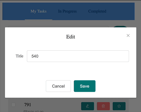
打完收工,效果圖如下
Leave a comment